Web portalInfographics
Complete guide to creating, editing, and managing public display templates in SmartgridX.
Info
Disclaimer
The mentioned functionalities may be restricted depending on the purchased software license.
Complete guide to creating, editing, and managing public display templates in SmartgridX.
The mentioned functionalities may be restricted depending on the purchased software license.
Public display templates are the foundation of your custom visualizations. They define the layout, structure, and visual elements that will be applied to your installations. This comprehensive guide covers everything from basic template creation to advanced design techniques.
Templates serve as reusable blueprints that:
| Benefit | Description |
|---|---|
| 🚀 Efficiency | Create once, use across multiple installations |
| 🎯 Consistency | Maintain uniform design standards |
| 🔧 Flexibility | Easy modification without recreating from scratch |
Before creating templates, ensure you have:
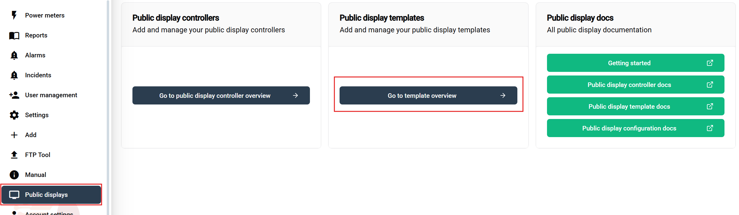
Navigation steps:
This opens the template management interface where you can view, create, edit, and delete templates.
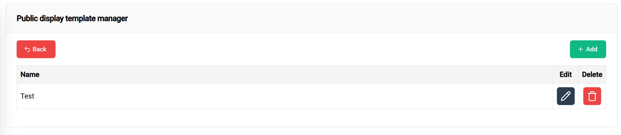
Available actions:
Click the "Create New Template" button to open the template editor interface.
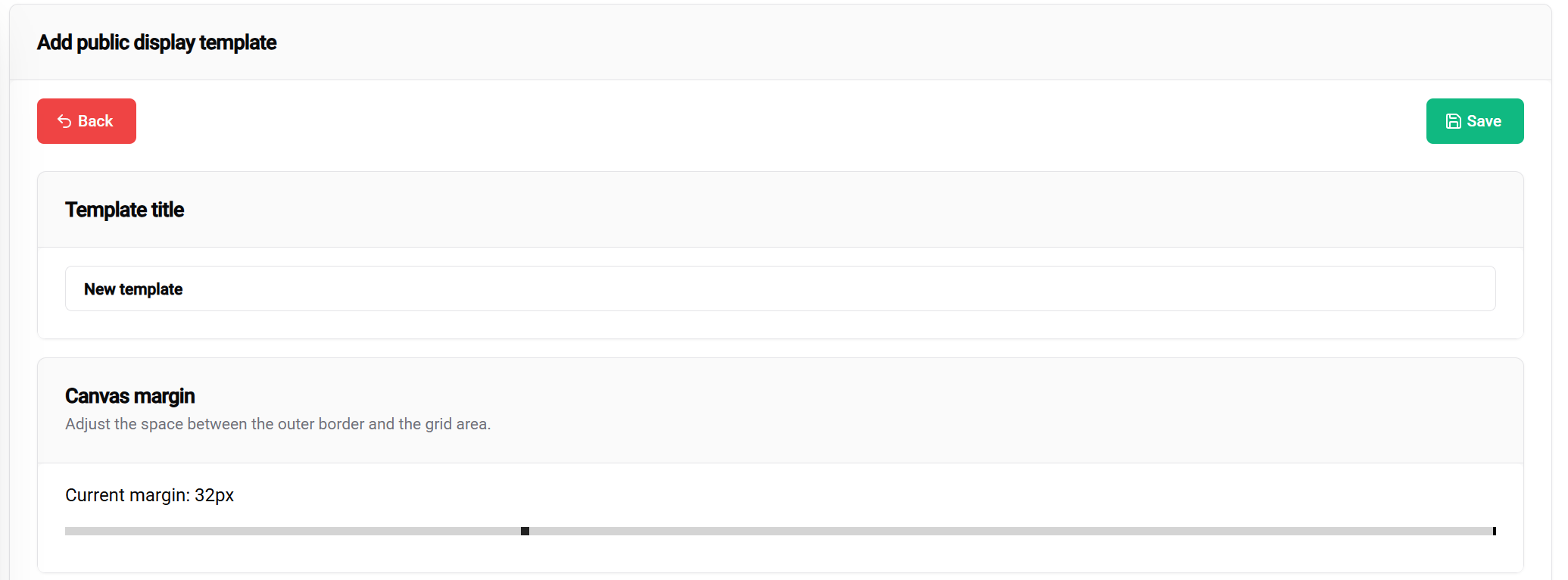
Template Title:
Margin settings define the safe area from the display borders:
Margin Slider (0-100px):
Visual impact:
The 💾 Save button (top-right corner) allows you to save your current template.
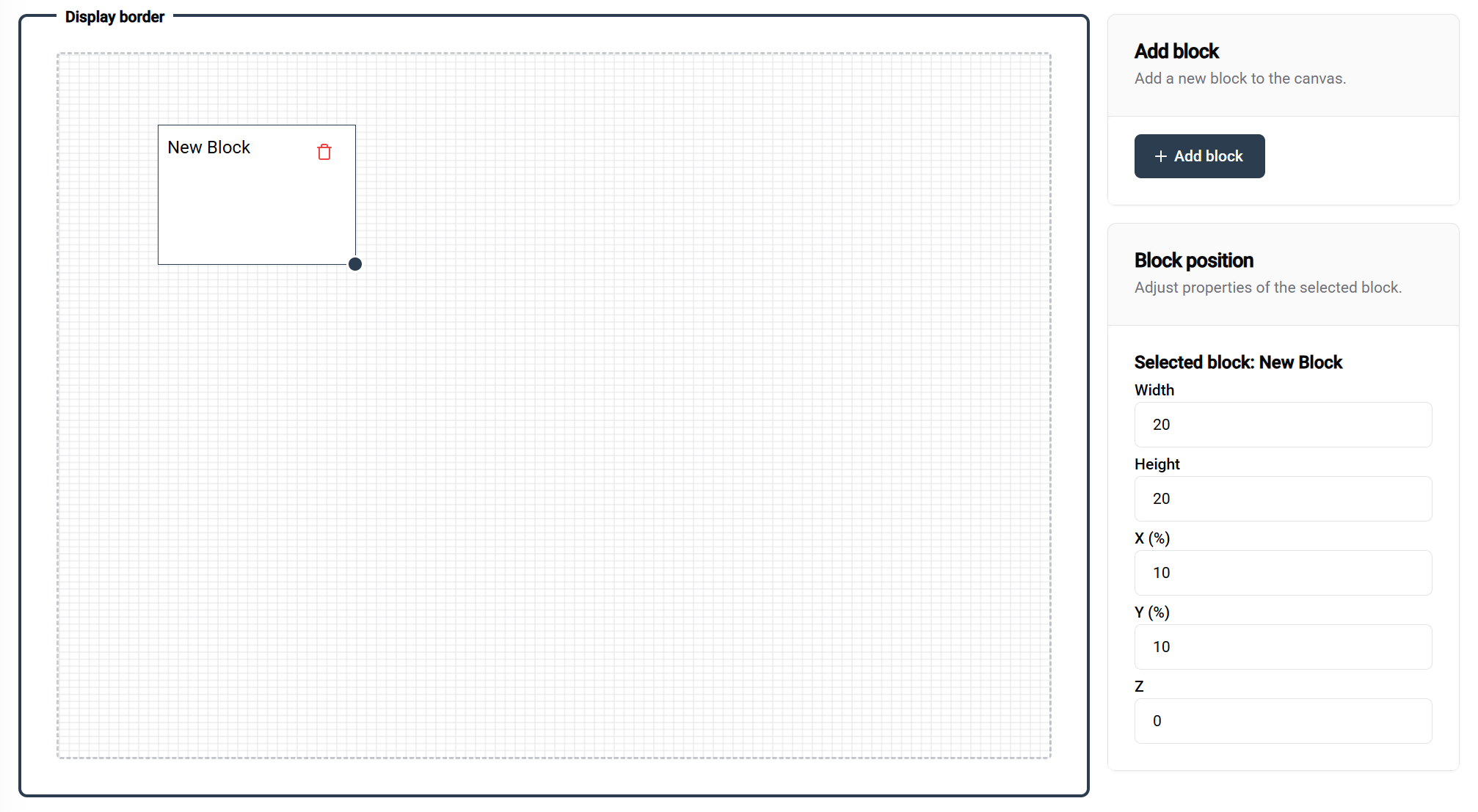
The template editor uses a 100×100 percentage-based grid system:
Grid Properties:
Configuration: 100 width × 100 height
Result: Full-screen coverage
Use case: Single large visualization, full-screen image
┌─────────────────────────────────┐
│                                 │
│         FULL BLOCK              │
│                                 │
│                                 │
└─────────────────────────────────┘
Configuration: Two blocks at 50 width × 100 height
Result: Split-screen layout
Use case: Comparison views, dual data displays
┌─────────────────┬───────────────┐
│                 │               │
│    BLOCK 1      │   BLOCK 2     │
│                 │               │
│                 │               │
└─────────────────┴───────────────┘
Configuration: Two blocks at 100 width × 50 height
Result: Vertical stack
Use case: Header/content, title/details layouts
Method: Click the "Add Block" button (top-right of editor)
Result: New block appears with default dimensions
Next steps: Position and resize as needed
Drag and Drop:
Resize Handle:
When a block is selected, the right panel provides:
Position Controls:
Method:
Note: Not all blocks are currently configurable. This will change as development continues. More block types will be added in future updates.
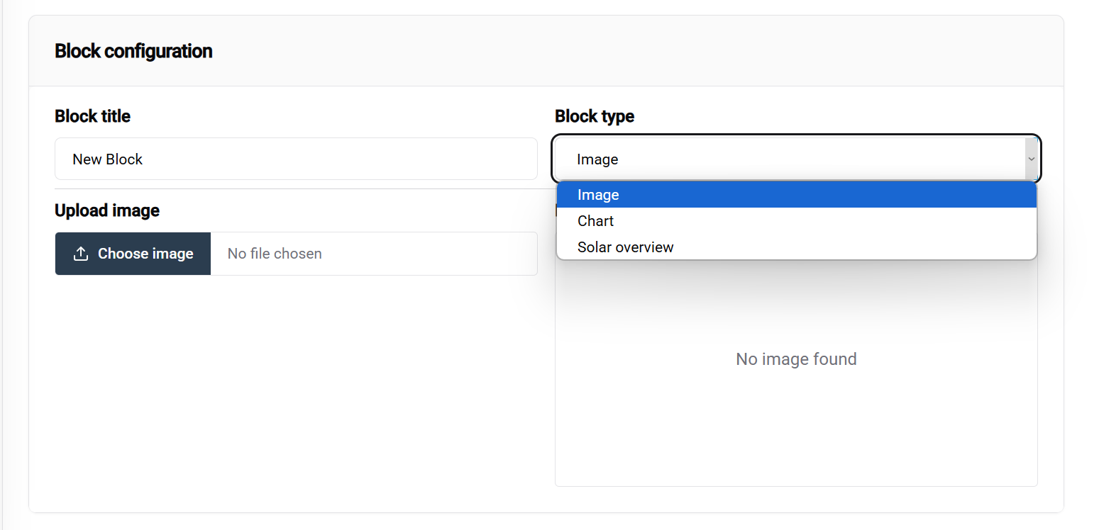
Purpose: Display static images, logos, backgrounds, GIFs Configuration options:
Use cases:
Purpose: Display realtime values
Use cases:
Purpose: Visualize data trends and comparisons
Configuration options:
Use cases:
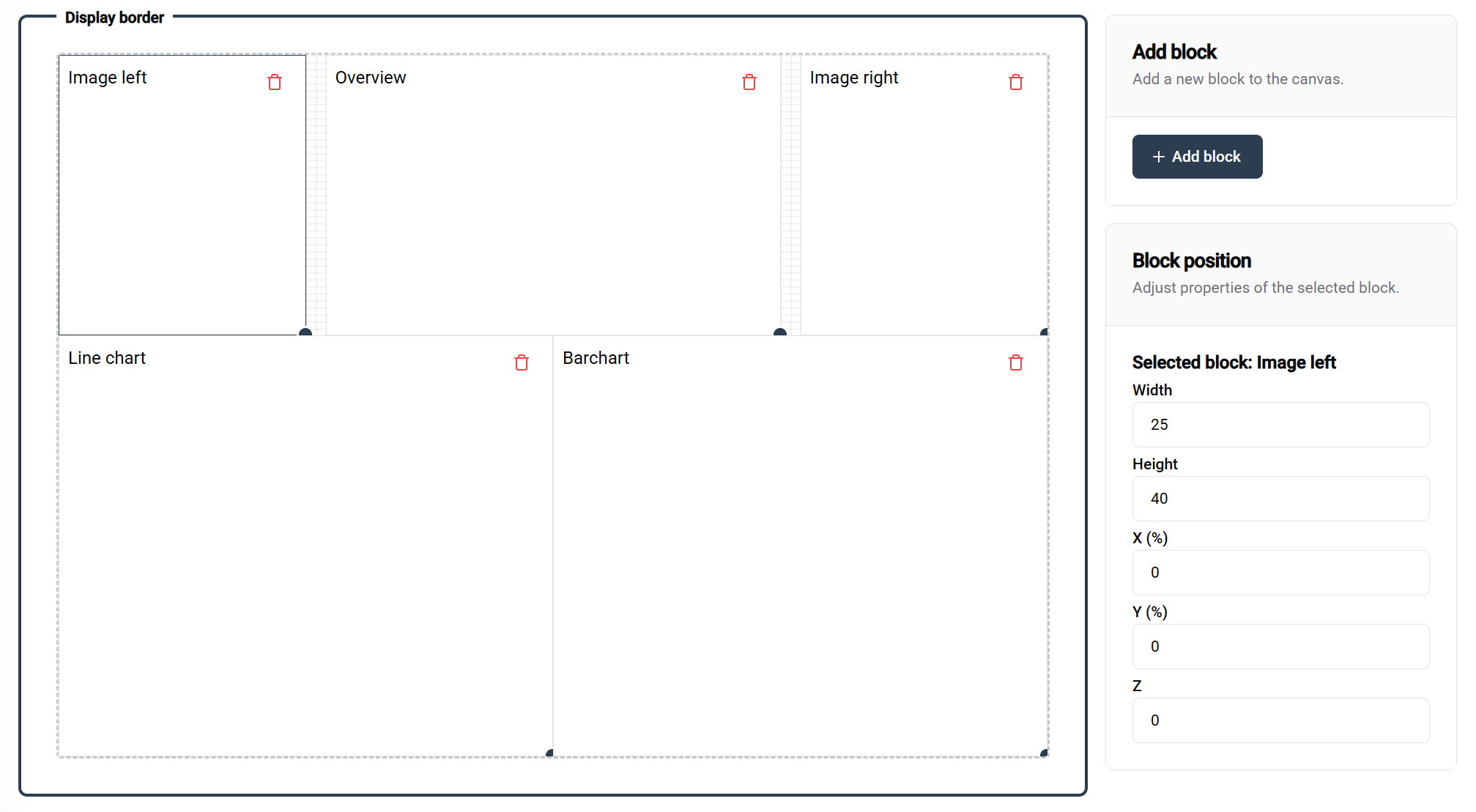
This example demonstrates a well-structured template with:
Block naming in this example:
After creating your template:
✅ Design principles:
✅ Organization tips:
🎨 Ready to Design? With your template created and configured, you're ready to deploy stunning visualizations across your SmartgridX installations!
┌─────────────────────────────────┐
│            BLOCK 1              │
│                                 │
├─────────────────────────────────┤
│            BLOCK 2              │
│                                 │
└─────────────────────────────────┘
Configuration: Four blocks at 50 width × 50 height
Result: Quadrant layout
Use case: Multi-metric dashboards, comparison grids
┌─────────────────┬───────────────┐
│    BLOCK 1      │   BLOCK 2     │
│                 │               │
├─────────────────┼───────────────┤
│    BLOCK 3      │   BLOCK 4     │
│                 │               │
└─────────────────┴───────────────┘